Why Nike isn't worried about reaction to new USMNT World Cup kits
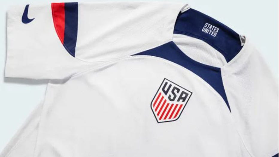
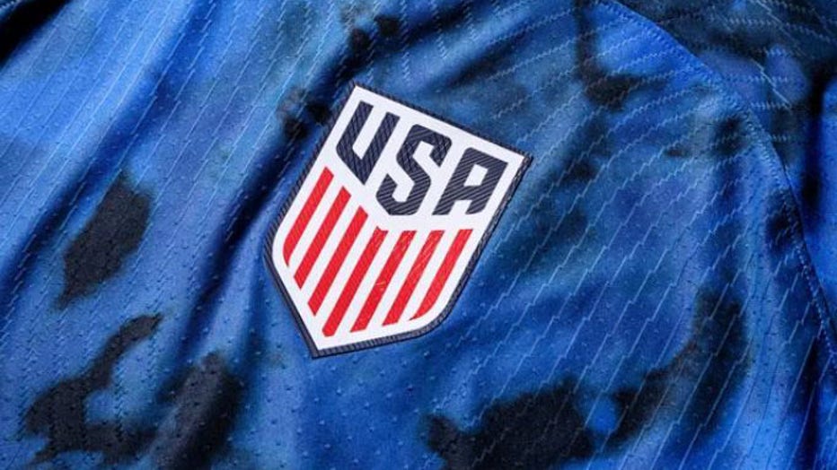
US kits feature iconic U.S. uniform design cues like bold stripes, an enlarged center crest akin to basketball jerseys and double Swooshes on the sleeves like those used on American football jerseys. (Photo courtesy of Nike)
Yunus Musah tried his best to be diplomatic.
On a late-August Zoom conference with reporters, the United States midfielder was asked for his impressions of the new Nike uniforms the men’s national team will be wearing when the 2022 FIFA World Cup kicks off in Qatar in November.
"The kits are … yeah. They’re the kits that they made, you know?" said Musah who, along with his U.S. teammates, first wore the retooled threads — which were officially unveiled on Thursday — in June during promotional photo and video shoots for the tournament. Pressed for his verdict, Musah rated the design "in the middle" rather than good or bad.
It was hardly a ringing endorsement. It was still better than the online reviews offered by fellow USMNT roster locks Weston McKennie and Tim Weah after leaked pictures of the new threads popped up online.

US kits feature iconic U.S. uniform design cues like bold stripes, an enlarged center crest akin to basketball jerseys and double Swooshes on the sleeves like those used on American football jerseys. (Photo courtesy of Nike)
Nike, understandably, didn’t appreciate the critiques. But the global sportswear giant is also used to taking pre-World Cup pot-shots over its fresh designs.
It happens every four years.
"People always hate the new jerseys at first," Aaron Barnett, Nike’s senior director of soccer apparel, told FOX Sports at a prelaunch event last month in New York. "Then your team wins its first game, and it’s the best jersey they’ve ever had."
It’s a fair point. Humans are both resistant to change and capable of adapting in short order. Truth be told, the new U.S. shirt isn’t remotely as radical as some of the more memorable versions from yesteryear. The "Bomb Pop" jersey of 2014, the red-striped "Where’s Waldo" one that debuted two years earlier, the garish denim kit the U.S. wore as World Cups hosts in 1994 – all were far more of a departure from the status quo at the time.
And each of them — the denim kit especially — were widely panned when they came out. Today they’re among the most fondly remembered USMNT uniforms of all time.
The aesthetic of the new U.S. shirt is downright tame by comparison. It does, however, have its own unique quirks, which help explain some of the handwringing.

US kits feature iconic U.S. uniform design cues like bold stripes, an enlarged center crest akin to basketball jerseys and double Swooshes on the sleeves like those used on American football jerseys. (Photo courtesy of Nike)
"We were really drawn into this idea of sports culture in the country," said Nike’s Rolando Cruz, who was involved in the creative process from start to finish. For inspiration, Cruz said, Nike "started looking at classic American jerseys across different sports."
It’s not a coincidence, then, that the Americans’ look will resemble the other football at the first World Cup to be staged during an NFL season. Of the 13 Qatar-bound teams that Nike sponsors, the U.S. is the only one that will have the company’s ubiquitous "Swoosh" logo on the sleeves rather than the chest. (Nike first tried this with a Paris Saint-Germain jersey last season.)
The shoulder stripes are right off the gridiron, too; while they’re reminiscent of those on the sides of the white tops the USMNT wore during its quarterfinal run in 2002, Barnett suggested it wasn’t deliberate. Each of the 13 Nike teams will also have their own unique font for names and numbers. The U.S.’s features blocky, old-school digits and lettering in keeping with the traditional American sports theme.
U.S. Soccer’s badge is noticeably bigger than usual on both the new white home jersey and blue away. That, too, was intentional. "We went to the rulebook, and we said what’s the largest crest that FIFA will allow us to put on this kit, and we did that," Cruz said.
It’s also positioned front-and-center instead of the usual spot over the heart. That, however, is far from a novel idea. England’s famous Three Lions crest was first sewn in the middle of their shirts a quarter-century ago; it reappeared there during the Euros last summer. The USMNT crest has also been emblazoned centrally in the past, notably during qualifying games for the 2006 World Cup.
Still, the new designs will take some getting used to. That goes both for supporters and for the men who will wear them on the global stage. Unlike the fans, though, the athletes had a say in how these turned out.
In January 2020, Cruz flew to Los Angeles to ask the USMNT players participating in a training camp what they wanted to see in the 2022 World Cup kit. Those conversations continued virtually after the pandemic struck. This makes the initial unfavorable response to the final product interesting, although it’s worth mentioning that Musah, McKennie, Weah and several other World Cup roster locks didn’t attend that early 2020 camp because of commitments to their European clubs.
But again, skewering the new kits has long been quadrennial ritual for a fickle public.
"People will always have opinions," said Barnett, a 26-year Nike veteran who early in his career was charged with presenting new designs to skeptical members of the U.S. men’s and women’s teams, current USMNT coach Gregg Berhalter and U.S. Soccer president Cindy Parlow Cone among them.
"I remember in 1998, in the room with Cindy and Brandi [Chastain] and Mia [Hamm]," he said. "I guarantee you there were as many opinions then as we have today."
The U.S. will debut the home kits later this month in its final two World Cup tune-ups, against Japan and Saudi Arabia. They’ll also wear the whites in their opening match in Qatar before switching to the aways against England and Iran.
The final verdict on the jerseys will largely depend on what happens at the main event, although it might not arrive for years afterward. Eventually, they will grow on people if history is any guide.
Musah seems at least open to the possibility. "I’m sure," he said, "they’ll look good enough on the pitch."
Get the latest updates on this story at FOXSports.com.


